Map run and analysis
Map run and analysis of doublet simulations
This is simple example of how to use the ThermoGISDoublet class to run the simulation for a set of maps and
p-values.
This example demonstrates the following steps:
-
Reading input grids and resampling at 5km cell size for:
- Mean thickness
- Thickness standard deviation
- Net-to-gross ratio
- Porosity
- Mean permeability
- Log(permeability) standard deviation
-
Running doublet simulations and calculating economic indicators (e.g., power production, CAPEX, NPV) across all non-NaN cells in the input grids for a range of p-values (10% to 90% in 10% increments).
-
Exporting results to file.
-
Plotting result maps for selected p-values (10%, 50%, and 90%) for:
- Power output
- Capital expenditure (CAPEX)
- Net Present Value (NPV)
-
Plotting an NPV curve at a single specified location on the grid.
Example input data for this workflow is available in the /resources/example_data directory of the repository.
This example corresponds to test case test_example6 in test_doc_examples.py in the tests
directory of the repository.
from pathlib import Path

import numpy as np
import xarray as xr
from matplotlib import pyplot as plt
from pygridsio import plot_grid, read_grid, resample_grid

from pythermogis.aquifer import StochasticAquifer
from pythermogis.doublet import ThermoGISDoublet
from pythermogis.postprocess import calculate_pos

# the location of the input data: the data can be found in the
# resources/example_data directory of the repo
input_data_path = Path("test_input") / "example_data"

# create a directory to write the output files to
output_data_path = Path("test_output") / "example6"
output_data_path.mkdir(parents=True, exist_ok=True)

# if set to True then simulation is always run, otherwise pre-calculated results are read (if available)
run_simulation = True

# grids can be in .nc, .asc, .zmap or .tif format: see pygridsio package
new_cellsize = 5000  # in m, this sets the resolution of the model;
# to speed up calcualtions you can increase the cellsize
thickness_mean = resample_grid(
    read_grid(input_data_path / "ROSL_ROSLU__thick.zmap"), new_cellsize=new_cellsize
)
thickness_sd = resample_grid(
    read_grid(input_data_path / "ROSL_ROSLU__thick_sd.zmap"), new_cellsize=new_cellsize
)
ntg = resample_grid(
    read_grid(input_data_path / "ROSL_ROSLU__ntg.zmap"), new_cellsize=new_cellsize
)
porosity = (
    resample_grid(
        read_grid(input_data_path / "ROSL_ROSLU__poro.zmap"), new_cellsize=new_cellsize
    )
    / 100
)
depth = resample_grid(
    read_grid(input_data_path / "ROSL_ROSLU__top.zmap"), new_cellsize=new_cellsize
)
ln_permeability_mean = np.log(
    resample_grid(
        read_grid(input_data_path / "ROSL_ROSLU__perm.zmap"), new_cellsize=new_cellsize
    )
)
ln_permeability_sd = resample_grid(
    read_grid(input_data_path / "ROSL_ROSLU__ln_perm_sd.zmap"),
    new_cellsize=new_cellsize,
)

aquifer = StochasticAquifer(
    thickness_mean=thickness_mean,
    thickness_sd=thickness_sd,
    ntg=ntg,
    porosity=porosity,
    depth=depth,
    ln_permeability_mean=ln_permeability_mean,
    ln_permeability_sd=ln_permeability_sd,
)

# output inputs
variables_to_plot = ["depth", "thickness_mean", "thickness_sd"]
fig, axes = plt.subplots(
    nrows=len(variables_to_plot),
    ncols=1,
    figsize=(7, 5 * len(variables_to_plot)),
    sharex=True,
    sharey=True,
)
for i, variable in enumerate(variables_to_plot):
    plot_grid(
        getattr(aquifer, variable), axes=axes[i], add_netherlands_shapefile=True
    )  # See documentation on plot_grid in pygridsio,
    # you can also provide your own shapefile
plt.tight_layout()  # ensure there is enough spacing
plt.savefig(output_data_path / "input_maps_1.png")

variables_to_plot = ["porosity", "ln_permeability_mean", "ln_permeability_sd"]
fig, axes = plt.subplots(
    nrows=len(variables_to_plot),
    ncols=1,
    figsize=(7, 5 * len(variables_to_plot)),
    sharex=True,
    sharey=True,
)
for i, variable in enumerate(variables_to_plot):
    plot_grid(
        getattr(aquifer, variable), axes=axes[i], add_netherlands_shapefile=True
    )  # See documentation on plot_grid in pygridsio,
    # you can also provide your own shapefile
plt.tight_layout()  # ensure there is enough spacing
plt.savefig(output_data_path / "input_maps_2.png")


# if set to True then simulation is always run,
# otherwise pre-calculated results are read (if available)
run_simulation = True
# simulate
# if doublet simulation has already been run then read in results,
# or run the simulation and write results out
if (output_data_path / "output_results.nc").exists and not run_simulation:
    results = xr.load_dataset(output_data_path / "output_results.nc")
else:
    doublet = ThermoGISDoublet(aquifer=aquifer)
    results = doublet.simulate(
        p_values=[10, 20, 30, 40, 50, 60, 70, 80, 90],
        chunk_size=100,
    ).to_dataset()
    results.to_netcdf(
        output_data_path / "output_results.nc"
    )  # write doublet simulation results to file
print("ready with simulation")


# plot results as maps
variables_to_plot = ["transmissivity", "power", "pres", "npv"]
p_values_to_plot = [10, 50, 90]
fig, axes = plt.subplots(
    nrows=len(variables_to_plot),
    ncols=len(p_values_to_plot),
    figsize=(3 * len(variables_to_plot), 5 * len(p_values_to_plot)),
    sharex=True,
    sharey=True,
)
for j, p_value in enumerate(p_values_to_plot):
    results_p_value = results.sel(p_value=p_value)
    for i, variable in enumerate(variables_to_plot):
        plot_grid(
            results_p_value[variable], axes=axes[i, j], add_netherlands_shapefile=True
        )  # See documentation on plot_grid in pygridsio,
        # you can also provide your own shapefile
plt.tight_layout()  # ensure there is enough spacing
plt.savefig(output_data_path / "maps.png")

# plot net-present value at a single location as a function of
# p-value and find the probability of success
results["pos"] = calculate_pos(
    results
)  # calculate probability of success across whole aquifer
x, y = 125e3, 525e3  # define location
results_loc = results.sel(
    x=x, y=y, method="nearest"
)  # select only the location of interest
pos = (
    results_loc.pos.data
)  # get probability of success at location of interest as a single value

# plot npv versus p-value and a map showing the location of interest
fig, axes = plt.subplots(ncols=2, figsize=(10, 5))
results_loc.npv.plot(y="p_value", ax=axes[0])
axes[0].set_title(f"Aquifer: ROSL_ROSLU\nlocation: [{x:.0f}m, {y:.0f}m]")
axes[0].axhline(
    pos, label=f"probability of success: {pos:.1f}%", ls="--", c="tab:orange"
)
axes[0].axvline(0.0, ls="--", c="tab:orange")
axes[0].legend()
axes[0].set_xlabel("net-present-value [Million €]")
axes[0].set_ylabel("p-value [%]")

plot_grid(results.pos, axes=axes[1], add_netherlands_shapefile=True)
axes[1].scatter(x, y, marker="x", color="tab:red")

plt.tight_layout()  # ensure there is enough spacing
plt.savefig(output_data_path / "pos.png")
The figure of input maps generated by the above code will look like this:
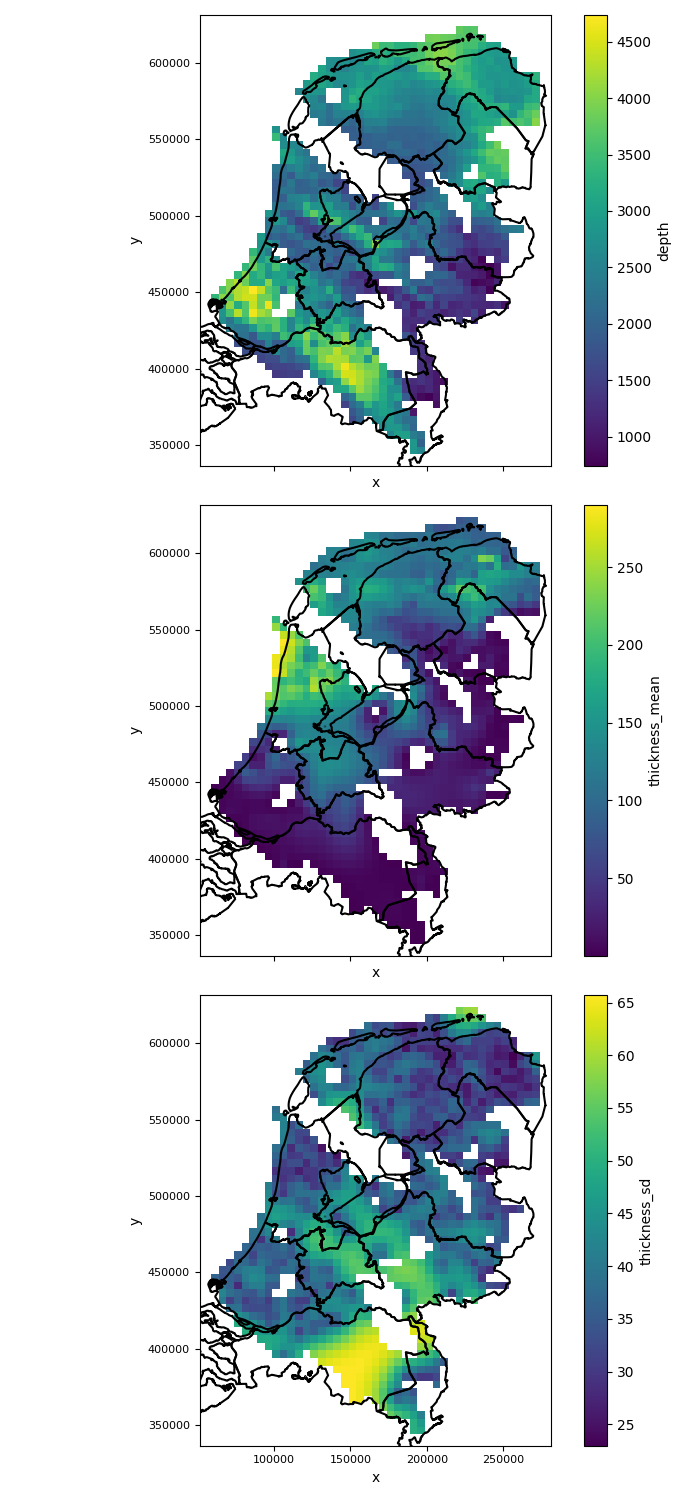 |
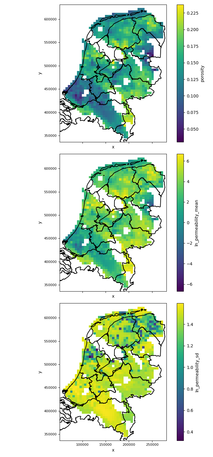 |
|---|---|
The figure generated by the above code will look like this:
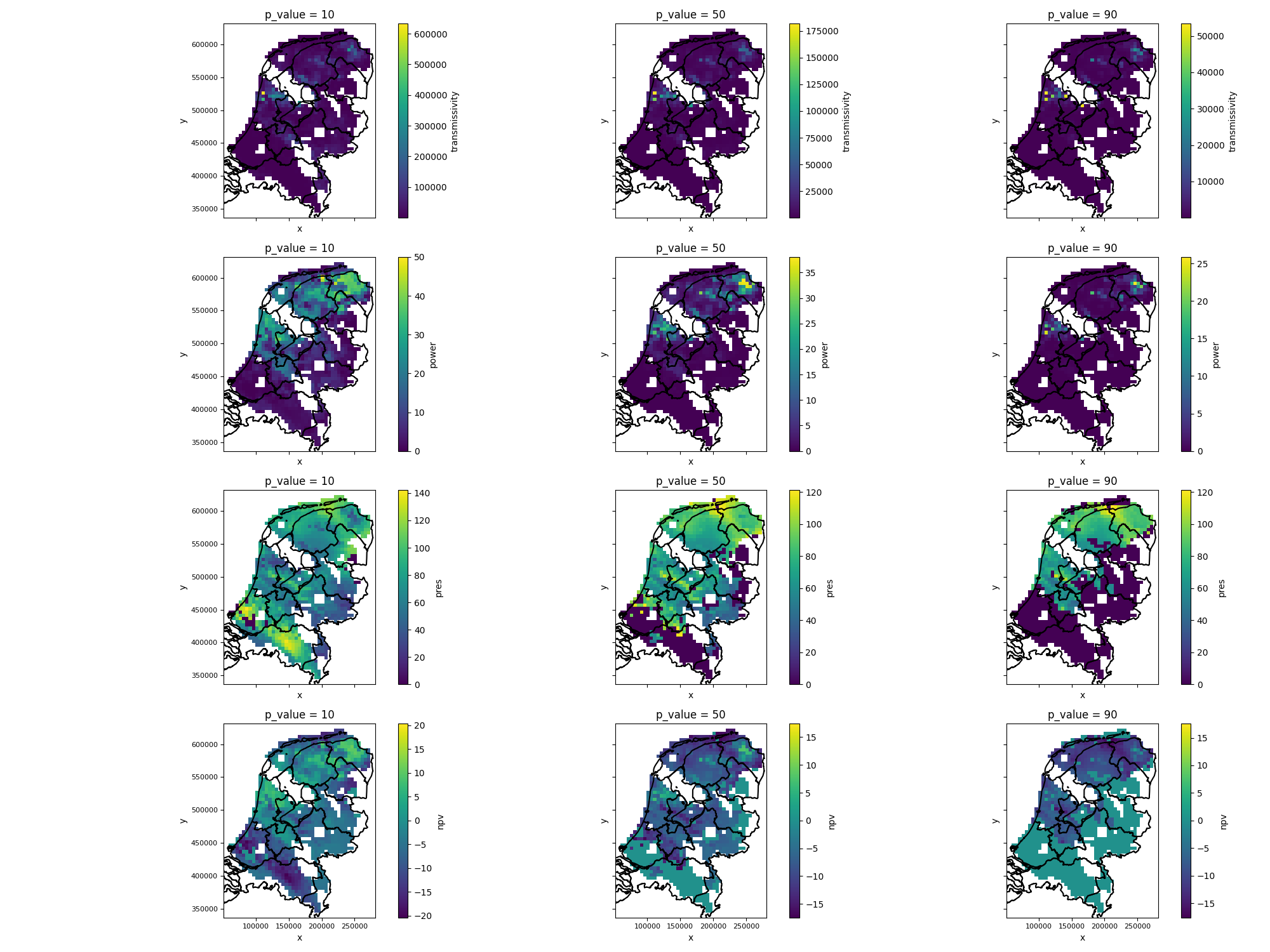
Figure: expectation maps for p-value tresholds
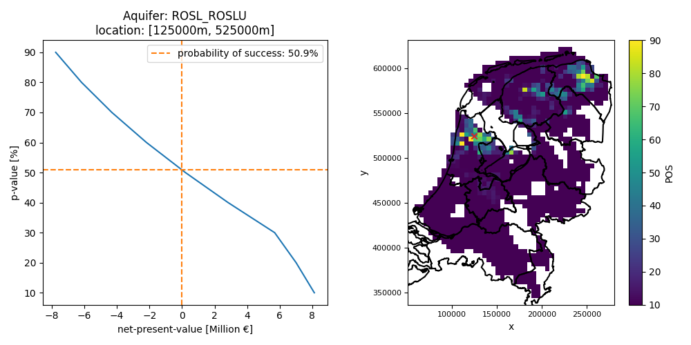 Figure: probability of success based on an NPV expectation curve at a single location